Keeping a Consistent Visual Look Across Your Blog

6 min read0 comments
Open a blog you love and scroll back through a few months of posts. Chances are the pictures feel as if they belong together, even when the subjects change completely. A market stall, a rainy window, a plate of noodles: different stories, but somehow the same eyes. That feeling is not an accident, and it does not need a professional camera. It comes from a handful of small habits repeated post after post.
This note is about those habits. We have written before about keeping the photos inside a single post in step with each other. Here we zoom out to the whole blog: how to give your pictures a look readers recognise, and how to write that look down so you can keep it.
Why a consistent look matters
On a PicaLook profile, your stories sit side by side like frames on a contact sheet. Readers see your covers as a set before they open any one of them. When the set hangs together, the profile feels like the work of one person with a point of view. When every cover pulls in a different direction, it can look more like a scrapbook than a blog.
Consistency also helps returning readers. If they meet one of your pictures on a topic page, among stories from other writers, a familiar colour or framing can tell them it is yours before they read your name. That small moment of recognition is worth a lot.
None of this means every photo should look the same. A good visual identity is more like a voice than a uniform. It leaves plenty of room for surprise, as long as the surprise still sounds like you.
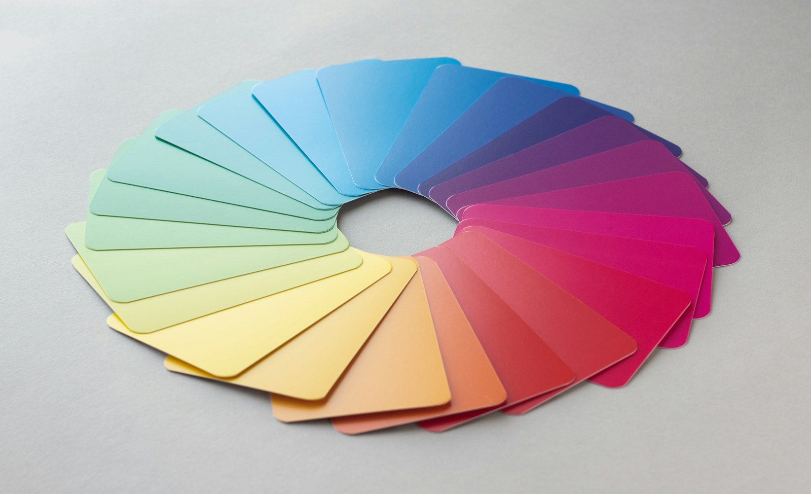
Find the colour mood you already have
Most people already lean towards a colour mood without realising it. The easiest way to find yours is to look back rather than forward.
- Gather twenty favourites. Pick the photos from your own posts that you like best, and lay them out side by side on one screen.
- Squint at the set. Look past the subjects and notice the overall impression. Is it warm or cool? Bright and airy, or low and moody? Soft colours or strong ones?
- Name it in a few words. “Warm, soft, morning light.” “Cool greys with one bright accent.” “Rich and dark, like an old café.” Keep the description short enough to remember.
Once you have a name for your mood, editing decisions become easier. A picture that is much colder or brighter than your description is not wrong, but you will know it is the odd one out, and you can choose whether to nudge it closer or let it stand apart on purpose.
Light matters as much as colour here. If you love the soft light of early morning, try to photograph at that hour more often. Getting the mood in the camera is gentler and more honest than forcing it afterwards with heavy edits.
Framing habits worth repeating
Colour is what readers notice first, but framing is what makes a set of pictures feel considered. A few repeated choices go a long way:
- Your usual distance. Some writers love close details: hands, textures, a single cup. Others step back to show the whole room or street. Neither is better, but choosing a favourite distance for most shots gives your work a rhythm.
- Your usual angle. Straight on, from above, or from a low corner. Food bloggers often settle on overhead shots; travel writers may prefer eye level. A steady default makes the odd exception feel deliberate.
- How much space you leave. Lots of empty space around a subject feels calm. A tight, full frame feels busy and close. Decide which suits your stories and lean into it.
- Where the subject sits. Centred subjects travel well, because covers get cropped into squares and circles in different parts of the site. If you like off-centre compositions, keep them for pictures inside the post.
These habits matter most for covers, since that is where readers see your pictures as a group. Our guide to choosing a cover image that tells the story goes into what each individual cover needs to do.
Write a one-page style guide for your pictures
Big brands keep thick style guides. You need something much smaller: a single page, in a notes app or on paper, that you look at before you shoot or edit. Writing it down turns a vague feeling into a few clear choices you can repeat.
A simple personal style guide might cover:
- Mood in three words. The name you gave your colour mood earlier.
- Light. When and where you prefer to shoot, for example “daylight by a window, never the overhead lamp”.
- Framing defaults. Your usual distance, angle and amount of empty space.
- Editing limits. How far you are willing to push warmth, brightness or saturation, and what you never do.
- Shapes. The two or three proportions you use, such as wide for covers and square or tall inside posts.
- Things to avoid. Clutter in the background, harsh flash, mixed light sources, whatever regularly spoils your pictures.
Keep it short. If the guide is longer than a page, you will stop reading it. If an item never changes a decision, cross it out.
It also helps to keep a small reference set alongside the guide: five or six of your own pictures that capture the look best. When you are unsure about a new photo, put it next to those and see whether it feels at home.
Keeping it steady without becoming rigid
A style guide is a tool, not a rule book. A few gentle checks keep it working for you:
- Edit in batches. When you edit all the photos for a post in one sitting, and with your reference set nearby, they stay closer together than when you edit one picture a day.
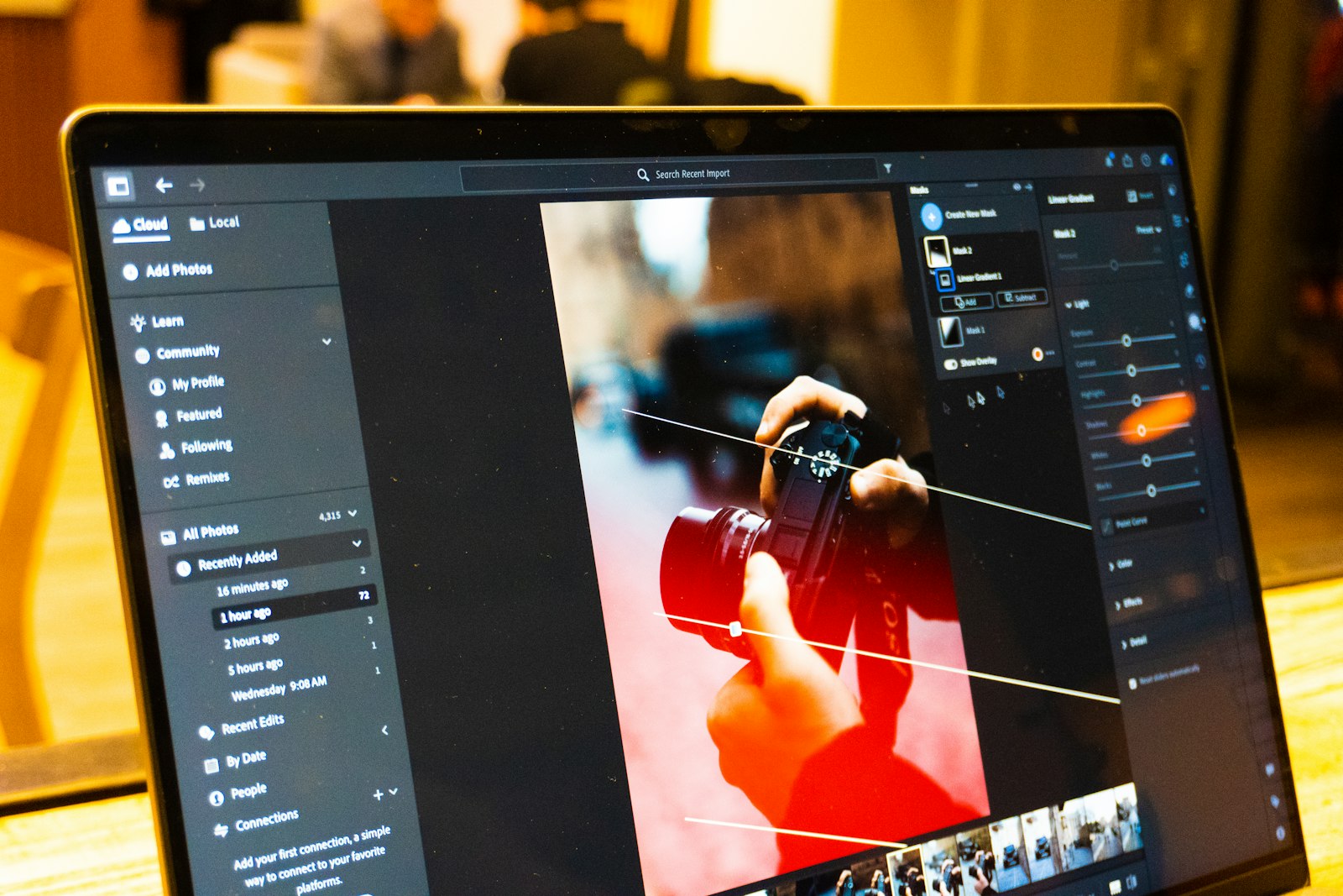
- Save your adjustments. Many phone and desktop editors let you copy settings from one picture to another or save them as a preset. Treat a preset as a starting point and adjust each photo by eye.
- Check the grid. After publishing, look at your profile as a reader would. If one cover jumps out for the wrong reasons, that is useful information for next time.
- Allow planned exceptions. A night-time story will not share your daylight mood, and it should not pretend to. Let exceptions happen because the story asks for them, not because you forgot the guide.
Above all, stay honest. A consistent look should come from how you see and shoot, not from bending pictures into something they were not. Our note on cropping and light editing that keeps photos honest explains where we draw that line.
Let your look grow with you
Your taste will change, and your style guide should change with it. Every few months, gather your recent favourites again and compare them with the guide. If the pictures you love most no longer match what you wrote, update the page rather than forcing the photos back into an old mould.
Readers rarely notice a slow evolution. What they notice is a blog that feels cared for, where each new story looks as if it came from the same thoughtful person as the last. Start with three words for your mood and one framing habit, and build from there. If you would like to see how covers and photos sit across a PicaLook profile, the features page shows what every blog includes.

Comments 0
Quiet so far. Tell the writer what this story made you see.
Add your view
A moderator looks at each comment before it is shown.